DateTime Picker Control
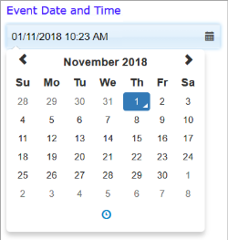
The datetime picker allows a user to type or select a date and time from a calendar and time range.
By default, the picker displays the current date and time when the page loads. You can edit the date and time shown, or make a selection from the popup calendar. Click the clock icon at the bottom of the calendar to select the time.
In Appearance properties you can show or hide the calendar icon by setting the Display Calendar Icon property On (default) or Off.
In Appearance > Options you set properties to customise the calendar and time functions.
In Data properties:
- The default time and date can be set with the Default Value property.
- By binding the control to a data object column using the Data Column property, the picker's initial value can be set from a data object, or the picker value set by a user may be used to update a data object when the page is saved. The data object column should be type DATETIME. See also Controls and Data Objects.
In Behaviour properties you can configure the picker to execute a workflow, JavaScript function, or web service when the time or date is changed.
JavaScript: You can use the FSI API methods fsi.getById() and fsi.setById() to get or set datetimes; for example:
function getStartTime(){
var startTime = fsi.getById('datetimepicker-U3Sc');
fsi.log(startTime);
}
function setEndTime(){
fsi.setById('datetimepicker-76sb','Thu Nov 07 2018 11:22:00');
}